In the world of interior design, color is one of the most powerful tools for transforming spaces. Beyond aesthetics, colors have a profound psychological impact, influencing our emotions, behaviors, and even how we experience the environment around us. Whether you want to create a calming sanctuary or an energizing workspace, understanding color psychology can help you make intentional design choices that enhance the atmosphere of your home.
This article will delve into the principles of color psychology in interior design, explaining how different hues affect mood and how to strategically use them to create balanced, harmonious living spaces.
The Basics of Color Psychology
Color psychology is the study of how colors influence human emotions and behavior. In the context of interior design, this understanding helps homeowners and designers create environments that evoke specific feelings. Different colors are associated with varying psychological responses, making it important to select shades that align with the mood or function of each room in your home.
Colors can generally be categorized into warm colors and cool colors, each evoking different emotional reactions.
- Warm colors: Reds, oranges, and yellows are considered warm tones. These colors tend to energize, stimulate, and create a sense of warmth and comfort.
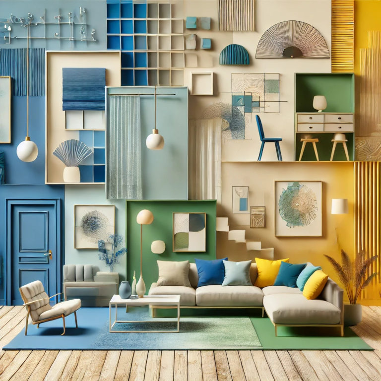
- Cool colors: Blues, greens, and purples are classified as cool tones. These colors are associated with calm, relaxation, and tranquility, making them ideal for spaces where you want to unwind.
1. Calming Blues for Tranquility and Peace
Blue is one of the most popular colors in interior design due to its calming and serene properties. It’s an excellent choice for spaces where you want to promote relaxation and peace, such as bedrooms, bathrooms, and living rooms.
- Light blue: Soft, light blues are perfect for creating a soothing environment. This shade is ideal for bedrooms, where it can help reduce stress and promote restful sleep.
- Deep blue: Rich, navy blues bring a sense of sophistication and elegance to a space. In dining rooms or home offices, deeper blues can evoke a calm, productive atmosphere without feeling too casual.
While blue is generally calming, it’s important to balance it with warm accents (like wood tones or neutral furnishings) to prevent the room from feeling too cold or detached.
2. Energizing Yellows for Creativity and Positivity
Yellow is the color of sunshine, symbolizing optimism, happiness, and creativity. It’s a great choice for areas where you want to feel energized and uplifted, such as kitchens, dining rooms, or home offices.
- Soft yellow: Pale yellows create a welcoming, warm environment without overwhelming the space. This is ideal for kitchens or living rooms where you want to promote a sense of warmth and social connection.
- Bright yellow: Vibrant, bold yellows can inspire creativity and energy, making them great for home offices or creative spaces. However, use these shades sparingly to avoid overstimulation.
Incorporating yellow as an accent color through accessories, artwork, or furniture can inject a burst of positivity without dominating the entire room.
3. Restful Greens for Balance and Harmony
As the color most associated with nature, green brings a sense of balance, harmony, and renewal to any space. Green is versatile, offering a wide range of tones that can suit different rooms and moods.
- Soft green: Light, muted greens (like sage) create a peaceful and restorative environment, making them ideal for bedrooms, bathrooms, or meditation spaces.
- Bold green: Darker, jewel-toned greens (like emerald or forest green) can evoke luxury and sophistication, perfect for dining rooms or home offices where you want to foster focus and balance.
Green’s association with nature makes it a popular choice for incorporating indoor plants and other natural elements, enhancing the room’s sense of freshness and vitality.
4. Bold Reds for Energy and Passion
Red is a powerful, stimulating color associated with energy, passion, and warmth. It’s a popular choice for making bold statements, but it requires careful consideration to avoid overwhelming the space.
- Deep red: Darker reds like burgundy or maroon create a sense of luxury and intimacy. These shades are excellent for dining rooms or living rooms, where they can encourage warmth and conversation.
- Bright red: Bold, fiery reds are highly stimulating, often used to create energy in active spaces like kitchens or exercise rooms. However, because red can increase feelings of anxiety in some people, it’s best used in moderation.
When using red, balance it with neutral tones or complementary colors like white or gray to prevent it from becoming too overpowering.
5. Serene Purples for Luxury and Spirituality
Purple is often associated with luxury, creativity, and spirituality. It brings a sense of elegance and mystery to spaces, especially when used in deeper tones like plum or amethyst.
- Soft lavender: Light purples and lavender tones evoke calmness and relaxation, making them a great option for bedrooms, children’s rooms, or reading nooks.
- Rich purple: Darker purples can add a regal, luxurious feel to a space. In living rooms or dining areas, deep purples create a sense of drama and sophistication.
Purple is often used in combination with metallic accents like gold or silver to further enhance its luxurious appeal.
6. Neutral Tones for Versatility and Balance
While bold colors play a major role in interior design, neutral tones like white, beige, gray, and taupe are equally important. These shades provide a versatile backdrop that balances stronger colors, allowing them to stand out without overwhelming the space.
- White: Pure white symbolizes cleanliness, simplicity, and freshness. It can make a room feel more spacious and open, making it an excellent choice for kitchens, bathrooms, and modern minimalist designs.
- Gray: Gray is one of the most versatile neutrals, offering both cool and warm undertones depending on the shade. Lighter grays create a calm, serene environment, while darker grays can add sophistication and depth.
- Beige and taupe: These warm neutrals evoke comfort and coziness, making them ideal for living rooms or bedrooms. They create a neutral canvas that allows accent colors to pop without clashing.
Neutrals are essential for creating balance in a room, offering a sense of grounding when paired with bold or vibrant hues.
Using Color Psychology to Enhance Your Space
When applying color psychology to interior design, consider the function of the space and the mood you want to create. For instance, if your goal is to create a relaxing environment in the bedroom, soft blues or greens will promote calm and restfulness. In contrast, energizing spaces like kitchens or home gyms benefit from warmer, more stimulating colors like yellows and reds.
Additionally, combining colors strategically can enhance a room’s overall feel. Pairing cool and warm tones creates a dynamic, balanced space, while sticking to a monochromatic palette (different shades of the same color) can create a unified, harmonious look.